What can this Dashboard do for you?
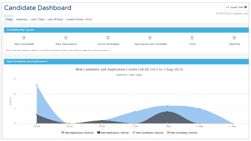
When you first access the Candidates Dashboard, you will be presented with a screen that looks like this:
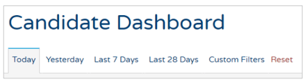
As always, you can use the quick-date range filters or custom filters at the top of the page:
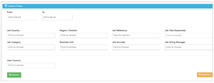
The Custom Filters included with this report are the standard ones that are included on the majority of reports:
Once you have selected your date range and/or filters, you will see figures similar to this at the top of the page:
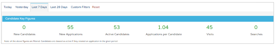
These are figures relating to the specific date range, and all relate to completed applications from candidates.
- New Candidates - this is in this time period only and relates to candidates that are brand new in the time period
- New Applications - this is again, in this time period only
You may see different figures in these two fields (as above) because you may not have completely new candidates in the time period.
What you are likely to see is more applications than numbers of candidates
- This indicates that candidates who registered before the time period have created applications at a later date.
- Active Candidates - this is an indication of how many candidates have applied for roles in the specified time period
- Applications per candidate - this is an average figure
- The example above shows that there are 1.04 applications per candidate
- As you can see, there are slightly fewer candidates compared to applications, which indicates that 2 of the candidates have applied for multiple roles
- Visits - this is the number of people who have visited your ATS
- This could be compiled of your internal users, candidates applying in the time period, candidates looking for updates on existing applications and even Tribepad colleagues if you are needing help from the Support team.
- Searches - this relates to how many searches have been done on your ATS
- Again, this could be compiled of all visitors to your ATS within the specified time period.
Scrolling further down the page, you will see several different infographics.
New Candidate and Application Counts
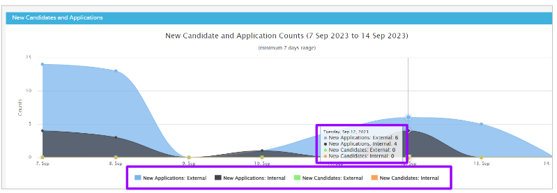
- Hover over the graph to see the numbers by Application and Candidate status
- You can remove any item in the graph by clicking on an item detailed underneath the graph (highlighted above)
- To revert back, re-select the item.
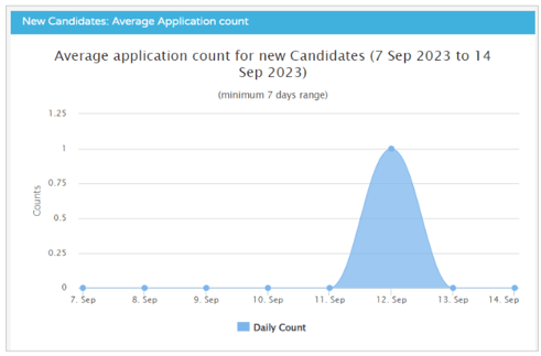
Time Taken for New Candidates to Create an Application
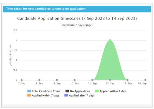
- As indicated on the infographic, a minimum timescale of 7 days is required for data to be presented
- This graph shows the time taken between the candidate creating their account and creating their first application.
Applications by Role
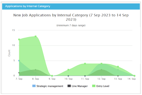
- This graph shows candidate applications broken down by departmental categories
- This information is determined at the time the job is created within the ATS.
Candidate Activity
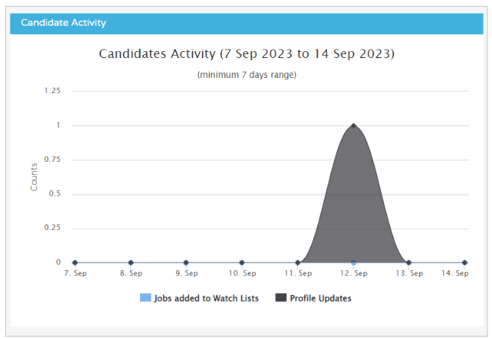
- This graph shows an overview of profile updates done by the candidate(s) and if any jobs have been added to a candidate's watchlist
- This is done by the candidate on their particular profile
- They would access the 'Job Search' section:
- They would then select 'Add to watchlist' on a specific job that they might want to keep an eye on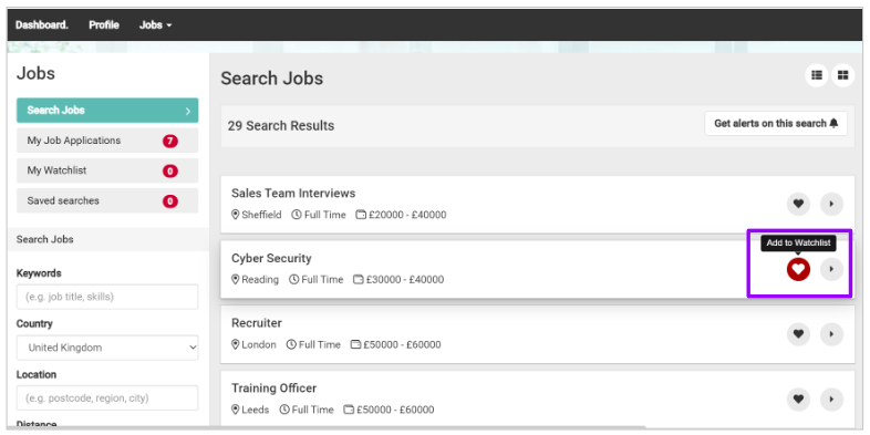
New Candidates - Average application count
- This graph shows New candidates created vs. the number of applications they’ve created in the specific time period
- This reflects the 'Applications per Candidate' figure shown at the top of the screen.
Top Skills
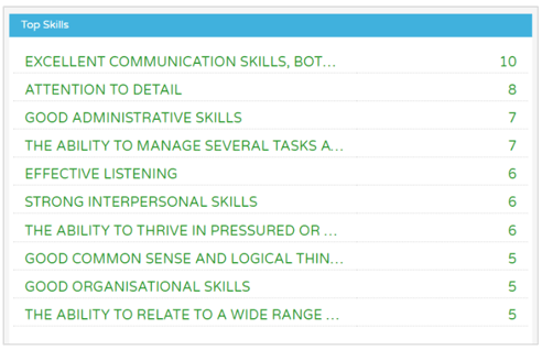
- These are the top skills which have been entered by candidates on their profiles, in the specific time period.
Top Searches
- This is linked to the 'Searches' figure presented at the top of the screen and shows the top number of keywords that have been searched for
- If no searches have been conducted, no data will be shown here.
Top Business Units by Application
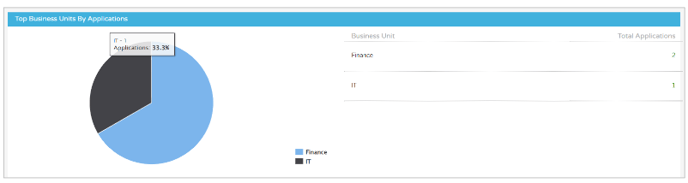
- This graph shows the highest number of applicants per internal business unit
- This information is determined when a job is created within the ATS.
Device Usage
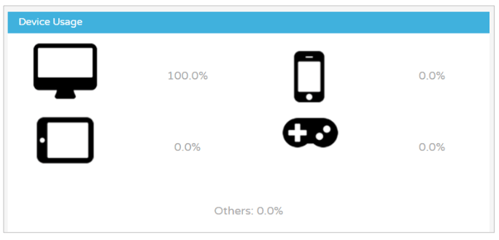
- This graphic shows which devices have been used by candidates when applying to or accessing the ATS
- This may be useful to you if you are working on a marketing campaign and would like to know who user interact with your ATS.
Social Media Authentication
- This will only show data if you have a permission turned on in your platform to allow candidates to sign-in with their Social Media accounts, namely Facebook and LinkedIn
If this is something you are interested in, please speak to your Tribepad Account Manager who can advise you further on this feature.
Candidates Locations (Top 20)
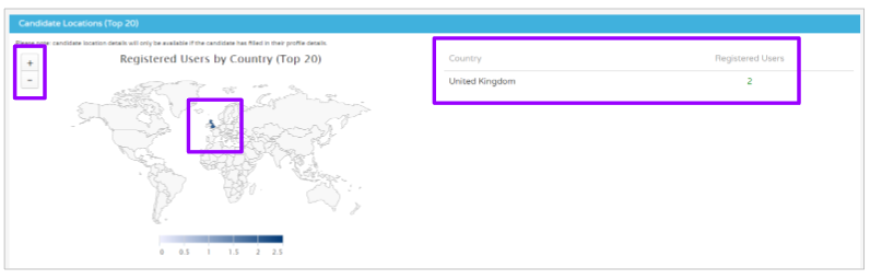
- Here you will see a map of the world and an indication on the map where your candidates have accessed your ATS from
- On the right-hand side you will see how many people and specifically which countries their IP address originates from
- You can zoom further into the map by using the zoom controls on the left-hand side of the screen.