In this report, you will be presented with a series of graphs and charts that make board reporting easier than ever.
The first graph you will be presented with is your "time to hire breakdown"
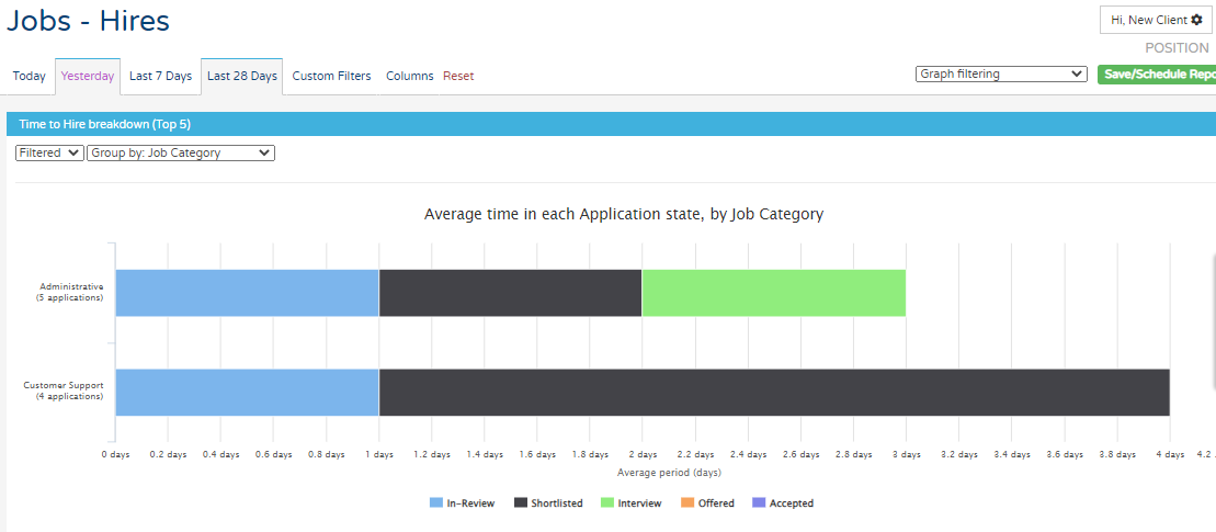
In this example you can see jobs filtered down by 'Job Category'. Across the bottom, there is a key that shows you what the coloured bars represents.
You can change the filtered option just above the graph to change the view depending on how you want to collect your data.
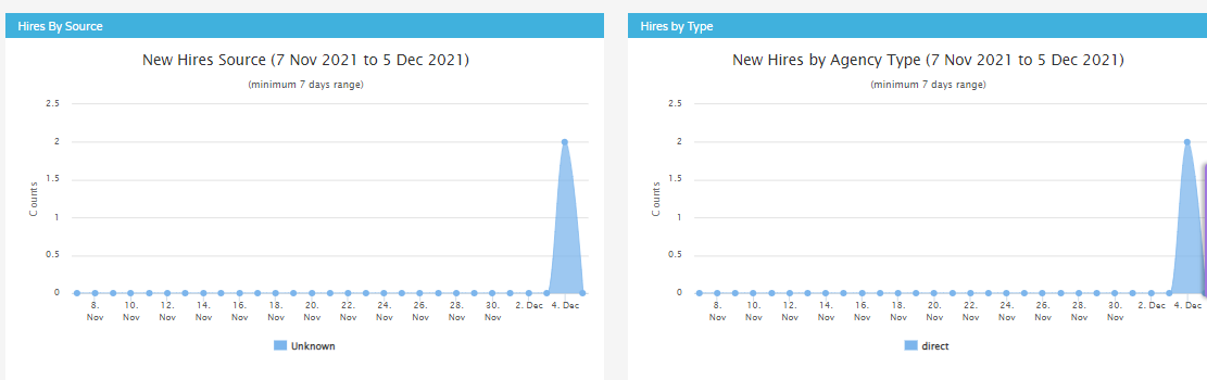
The below graphs show the source of the hire and the hire by agency.
In every report available within insights you are able to download a raw data format to be able to manipulate in excel outside of the platform. To see how to do this please see the below link to the raw data article:
Raw Data - Click Here
Also, in every report you will have the option to be able to custom filter your data to handle this in easier chunks of information. To read up more about Custom filtering please see the link below:
Custom Filters - Click Here