Find out how to build your own Careers Site for your ATS ***Currently GRO customers only***
Tribepad’s Careers Search site has been traditionally given (*for a fee) to all new customers. The ATS has linked into the Job Search site, and allows you to post vacancies. This has been a set format and so little customising has been possible.
Introducing Tribepad's new Careers Site Builder. You can now create your own Careers Search site and make it unique to your organisation.
Initially, this feature will be given to all new Gro customers and replaces the need to pay for a Job search site with Tribepad. Pro customers will be able to access this feature late in 2024 (date TBC).
Creating a Careers Site
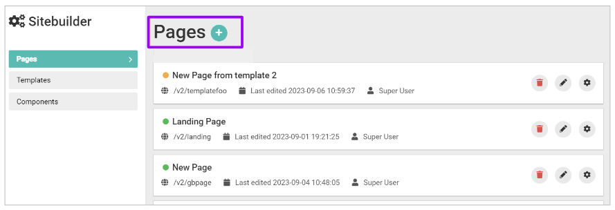
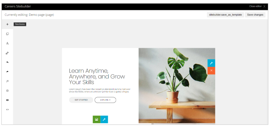
To access the Careers Site Builder, go to your ‘Tools’ or jobs menu and select ‘Site Builder’: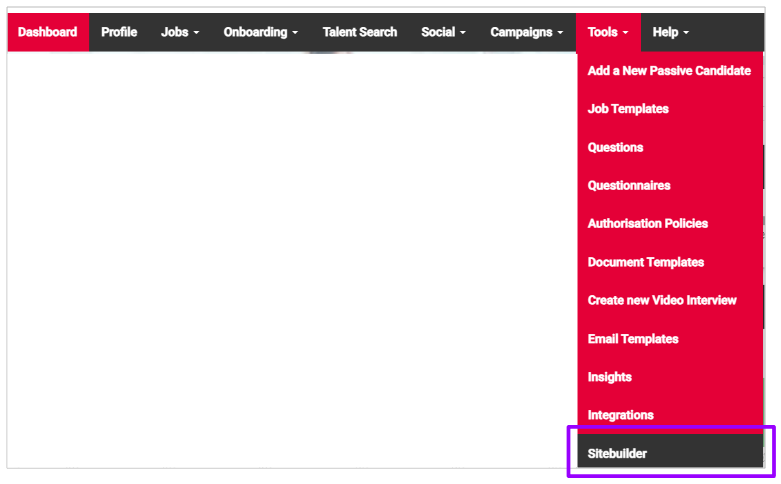
From here, you have the ability to build individual Pages, Templates or Components for your Careers site:
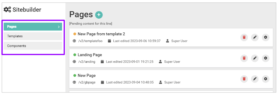
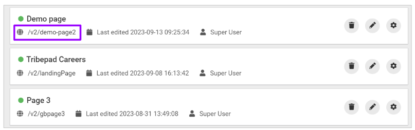
- A Page is the page on the end of a URL, for example ‘Demo page’
- A Template is what can be created to base new pages from
- A Component is something that can be added to your pages as a consistent entity, for example a Header or Footer. These can be included in Templates if you wish.
To add a new page, click the ‘+’ symbol:
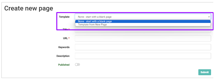
When creating a page, you can create this from scratch or from a template:
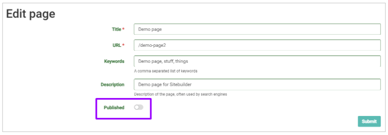
Give your page a title and enter the URL that it will be linked to:
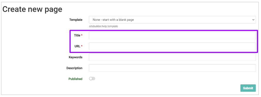
- The ‘Title’ refers to what the tab on the page will say, when viewed in a browser
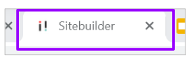
- For example, for the Careers Site Builder, the title on the tab is ‘Sitebuilder’:
- The URL is where you would like to link to
- For example, if your page is titled ‘Demo Page’, your URL might be /demo-page
- You should add a / at the beginning of the field, but if you miss this, don’t worry, we will add this in for you.
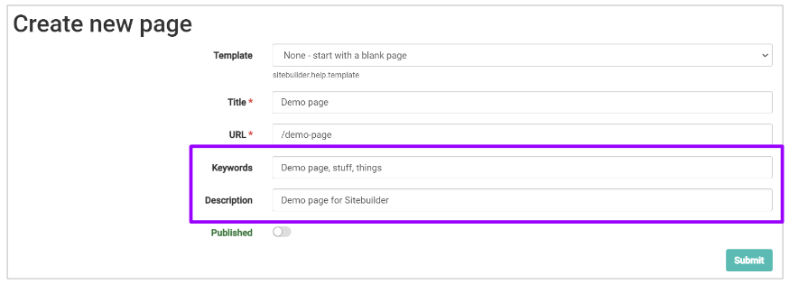
Next, you can add in any Keywords and a Description that you would like to be connected to your page:
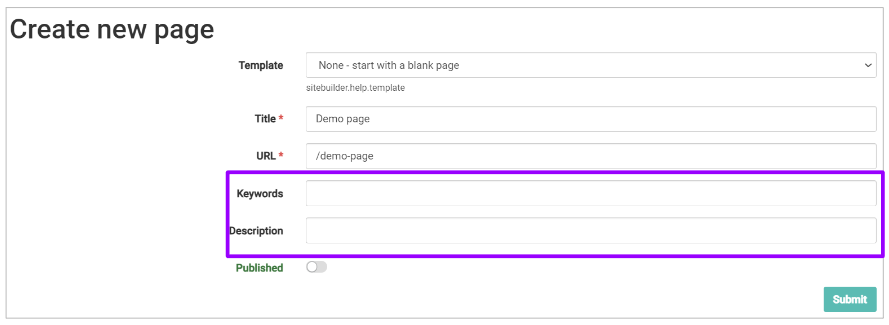
- These relate to the SEO (Search Engine Optimisation) Keywords and Description
- The Keywords would be something that relates to the page in question
- For example, if your page relates to Finance jobs in Sheffield, you could enter ‘Finance’ and ‘Sheffield’ here
- They should be separated by a comma when entering multiple words or phrases
- The Keywords would be something that relates to the page in question
- The Description is simply text that relates to the page
- For example if we continue the ‘Demo page’ theme, you might enter ‘Demo Page for Tribepad’
Finally, on this page, you can choose if the page is to be ‘Published’ or not, i.e. made live to view externally
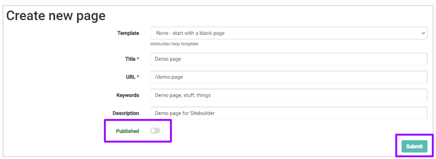
- Simply toggle the ‘Published’ option on as required
When you are happy with your initial content, click ‘Submit’.
Adding Content to your Careers site
Clicking ‘Submit’ take you to the Content pages of Sitebuilder: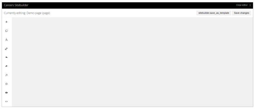
You have several options running down the left-hand side of the page:
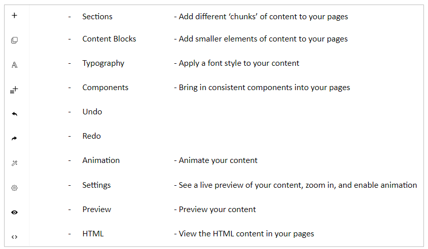
- With these tools you can determine what information you want to display on each page. This may include job listings, company values, employee testimonials, or other career-related content.
Sections
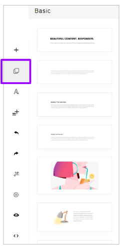
Clicking on the ‘Sections’ option at the top of the page, will show you what you can add to your Careers site: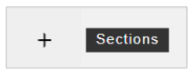
At the top of the page you will see headers for the type of content that can be added to a page:
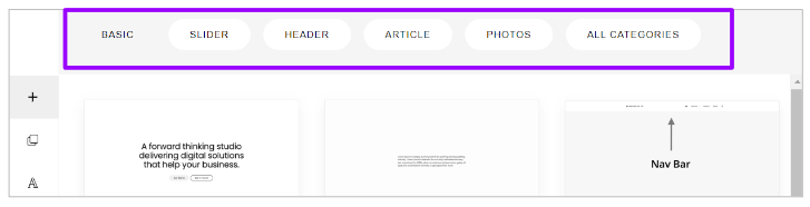
- Click through each header to see examples of what can be to a page
All Sections that are added to a page, are fully customisable.
Simply click on the relevant Sections you require, and they will be inserted into the main screen:
- You can add as many Sections as you like here
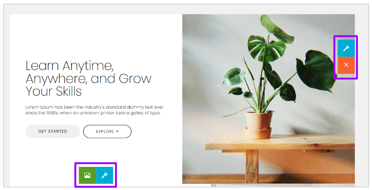
To edit the text or image on a Section, simply click onto the relevant part you wish to change, and you can alter as appropriate
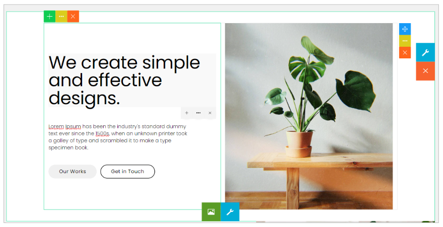
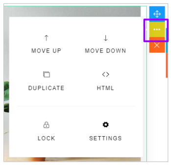
- Clicking on these icons
will allow you to
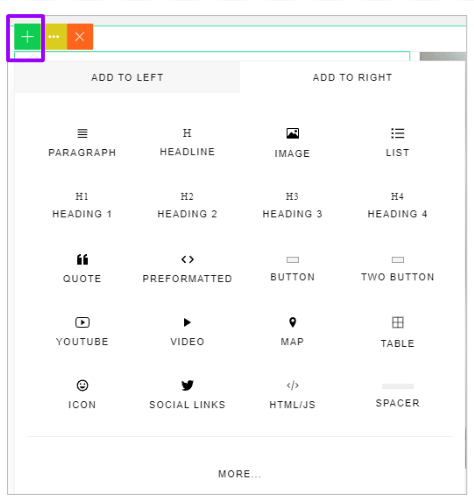
- Add additional content (‘+’ symbol)
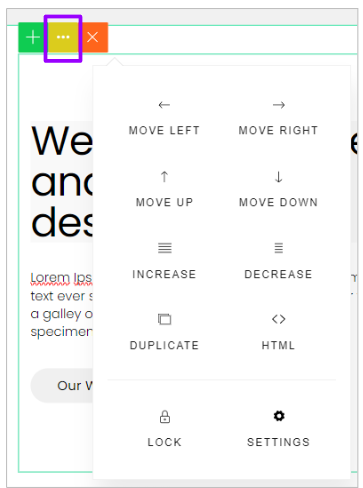
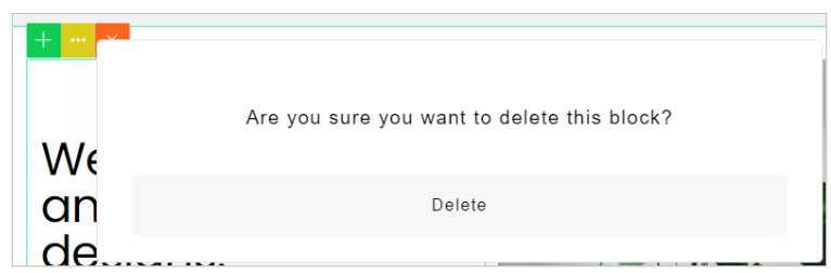
- Change the look and feel of the Section (‘...’ symbol)
- Remove blocks of content (‘X’ symbol)
- Clicking on these icons
on an image will also allow you to
- Move the image (‘Compass’ symbol)
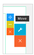
- You can do this by dragging the icon around as required
- Change the look and feel of the Section (‘...’ symbol)
- And again, remove the content completely (‘X’ symbol).
Once you are happy with the content of your Section, you can edit it further by hovering over it to reveal these icons:
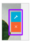 allow you to access the settings of the specific Section and remove the Section:
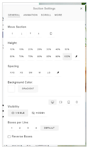
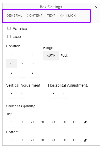
Within the Settings, you can move the Section around (if you have selected multiple Sections), adjust the height, adjust the spacing, change the colour of the Section etc.
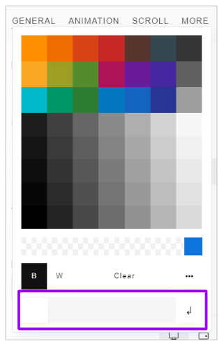
Clicking on the ‘Background Colour’ option presents a further pop-up and you can choose from a pre-set colour or enter the RGB values at the bottom of the screen to enter a custom colour:
The ‘Visibility’ option allows you to make the your content visible or hidden on a range of devices:
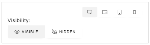
- You can click between the symbols to decide if your content will be visible on
A desktop
A laptop/tablet (Landscape)
A tablet (Portrait)
A mobile
The ‘Boxes per line’ and ‘Reverse boxes’ options relate to what that particular Section looks like:
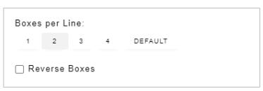
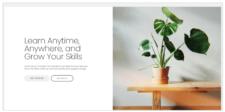
- With the Section example we have used above, this is made up of 2 boxes placed side by side:
- The text on the left-hand side and the image on the right-hand side
- Selecting the ‘1 box per line’ option puts the boxes underneath each other
- ‘Reversing’ the boxes flips the boxes over to the different side.
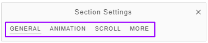
Further ‘Section settings’ can be found under the headers at the top of the pop-up:
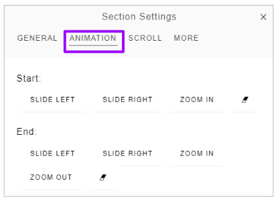
The ‘Animation’ header allows you to amend any animations you may have included in your pages:
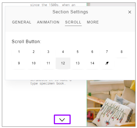
The ‘Scroll’ header allows you to choose the style of scroll button that is placed on your pages
- For example option ‘12’ looks like this:
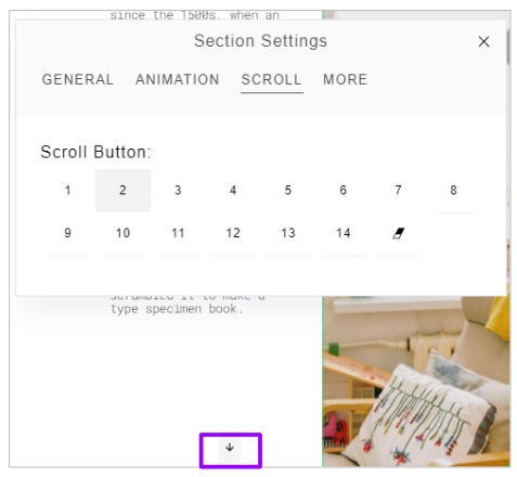
- But option ‘2’ looks like this:
Finally, the ‘More’ header allows you to add a Section ID and CSS Classes
- A Section ID is added to the top left corner of the section if you wish:
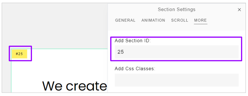
- This can be numerical or text
Alternatively, clicking on these icons on a Section allows you to edit the box rather than the individual elements:
- Again, this option has several headers which allow you to do different things:
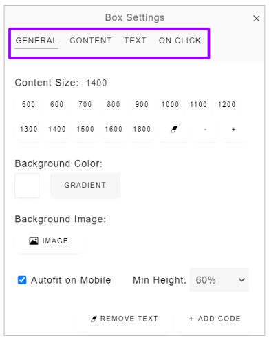
- Change the size and position of the content
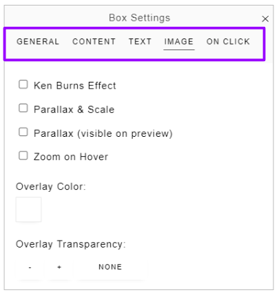
- Add background images
- Add effects to Images
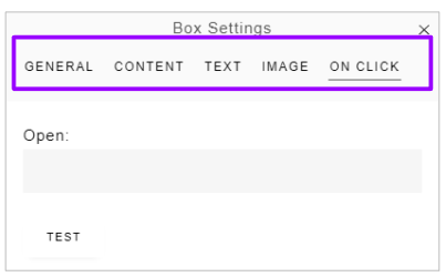
- Add in links to different elements of your section
With the adding of links into your pages, you can enter any URL here to link to
- For example, you might want to enter your Job Search page on your website
- This will be your URL with v2/job/search at the end, don't worry, we will help you find this.
Content Blocks
To add them, they should be dragged into the relevant position on the right-hand side.
They are edited and amended in the same way as Sections, using the icons on the right side of the block:
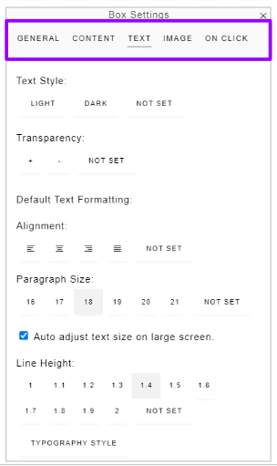
Typography
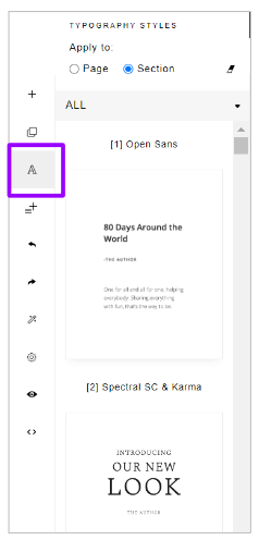
- Simply select the relevant one from the list to change as required.
Components
Components can also be added to pages, but these should be created via the link in the ATS: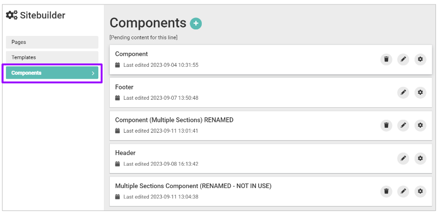
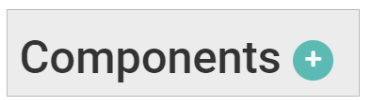
To add a Component, click the ‘+’ symbol:
The screen will refresh and you will be presented with this screen:
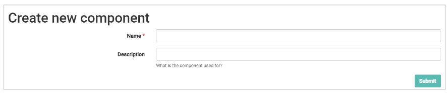
- Give your Component a name and a description - these will only be visible to internal ATS users
- For example, you might enter ‘Header’ for the name and ‘To be used for x purposes’ in the description.
You will again be presented with this screen:
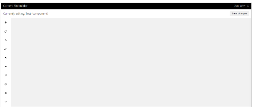
- All functionality on this screen, is as described above
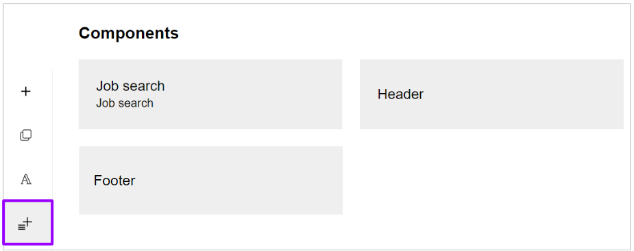
Once you have created a Component, you will be able to select it from the left-hand options and insert into a page, as detailed above.
Please note - if you wish to edit a Component, you need to go through the ATS for your changes to take effect.
If you have used the same component on multiple pages, if an edit is done through the ATS, the edit will be shown on all pages.
There will be certain templated components that you can use in this section, for example a Header, a Footer or a Job Search section
- All of these can be added in when you select the Components button:
Adding the Job Search component to your page will show something that looks like this:
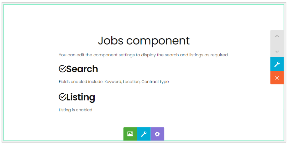
As above, you have the usual options of editing the section on the right and at the bottom.
You do also have the added function on a Cog menu:
If you click this option, you will be given a further set of options to choose from:
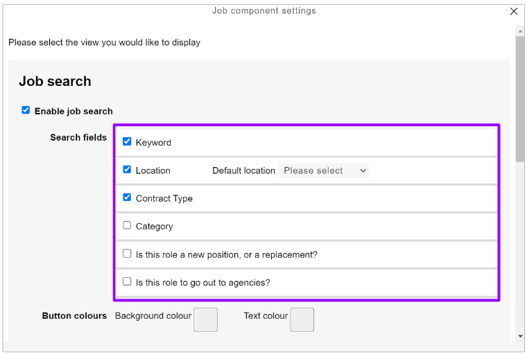
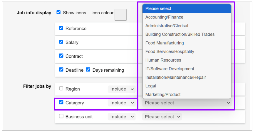
In this pop-up window, you can see options that relate to Jobs in your ATS.
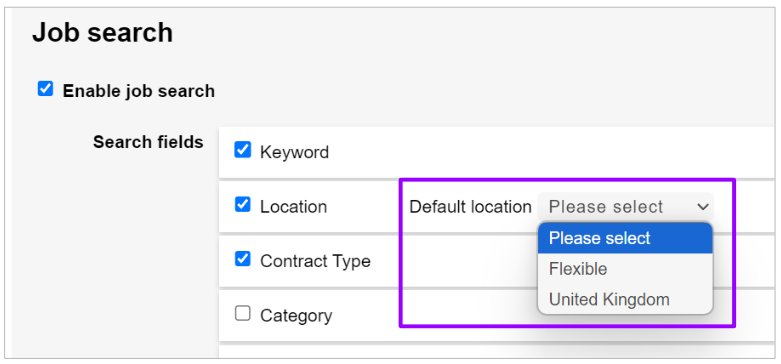
Please note - if your jobs relate to a specific location or you always select ‘United Kingdom’ on your jobs when you are creating them in the ATS, you will need to specify which location is applicable from the drop-down menu:
Further down this settings page, you will also see a set of filter options:
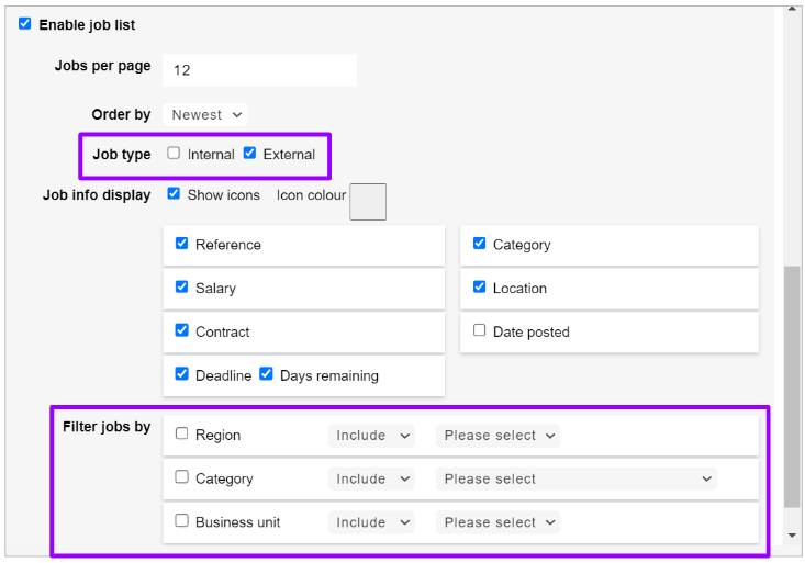
Points to note here:
- If you would like to only show Internal jobs only on your Job Search page, please select the relevant tick box (highlighted above)
- If you would like filters to be applicable on this job search section, please ensure you specify which filters you would like to include
- If you select one of the tick boxes on the left, ensure you select an item from the drop-down menu on the right:
Please note - you can only add 1 job search widget to a page.
Animations
Clicking on ‘Animations’ opens up these options on the right-hand side of the screen: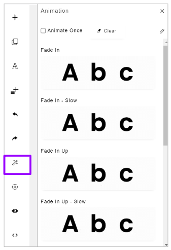
- Here, you can apply Animations to your pages if you choose
Settings
Clicking on ‘Settings’ gives you these options: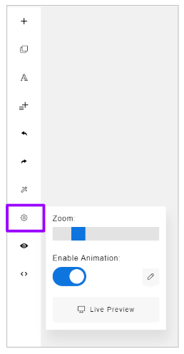
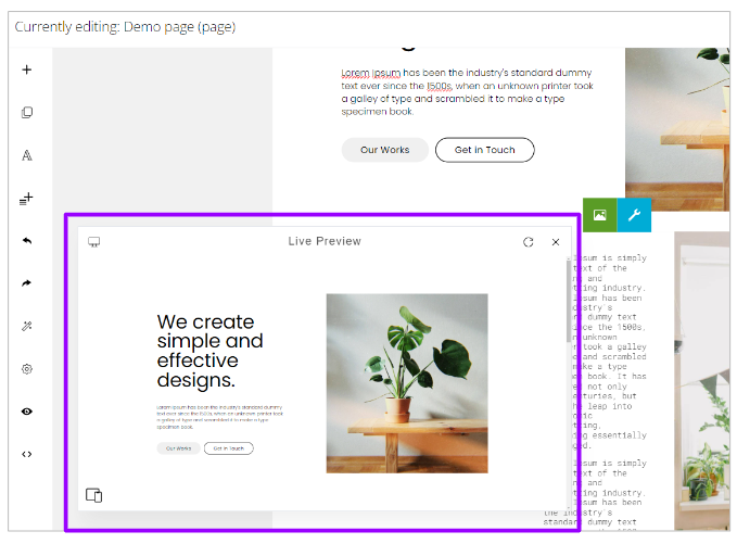
Here you can zoom in or out of your pages, enable animation and see a live preview.
A Live preview is different to a Preview as the content is shown within an internal window at the bottom of the screen:
Preview
Clicking on the Preview option opens up your pages in a separate tab in your browser: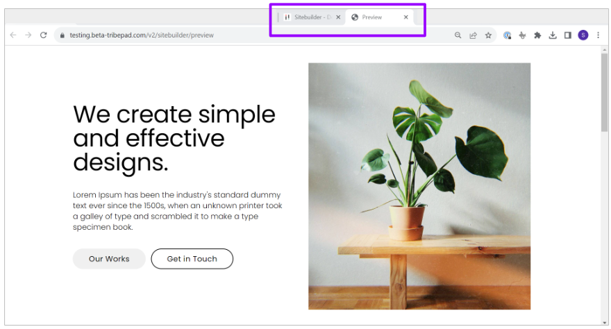
Once you are happy with your content, you should select ‘Save changes’ in the right-hand corner:
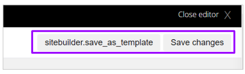
- Alternatively, if you wish to save your pages as a template for future use, you can select ‘Save as template’ instead.
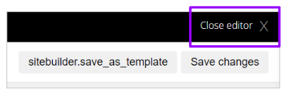
To return to the ATS, click ‘ Close editor’ in the top right-hand corner:
Publishing your Careers page
Once you have saved your pages, you will need to Publish them to make them live.To do this, go to the Settings on your page from the ATS:
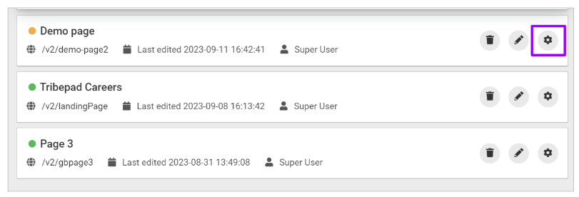
Toggle on the ‘Published’ option:
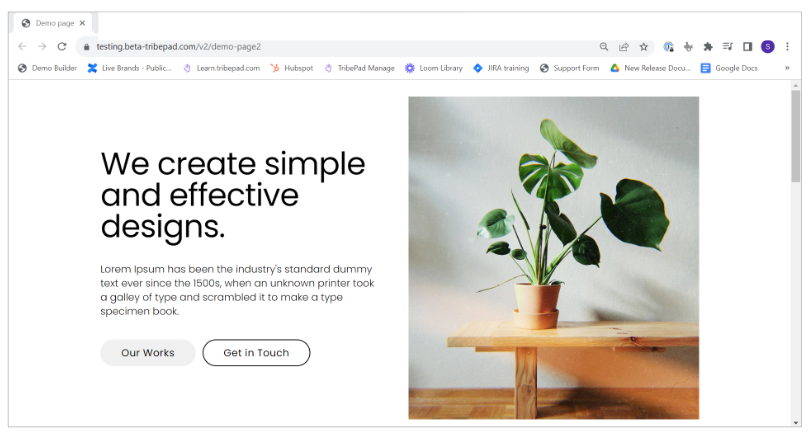
If you click on the URL of your page, you will be taken to the live Careers page: